In this report, I will explain what I have learned and done. Through this lecture, I have learned much more about “COLOR”. Blue is not only as “Light Blue”, “Blue”, and “Deep Blue”. Now, I can identify Blue as blue-green, blue, or blue-violet. I have more adjectives to tell people what is the color by color theories.
Color is an external occurrence and an internal sensation. Surfaces appear colored because they reflect certain light waves which stimulate brain receptors. So a surface appears colored when an external event and an internal event combine into an experience.
Color defined in primaries (in yellow, red, blue), secondaries (in orange, violet, green) and tertiaies (in yellow-orange, red-orange, red-violet, blue-green, blue violet, yellow green). Then, those hues are all in Color Wheel. Color also expresses gender. Warm hues, light values, and soft intensities seem soft and feminine; cool hues, dark values, and bright intensities seem strong and masculine. Bright colors in sports uniforms are often seen as masculine. Western cultures consider pink as feminine and blue as masculine, oriental yin-yang considers light colors masculine and dark colors feminine; so associations often depend on culture.
See what colors people wear, and we can easily analysis where they come from. It is because different countries apply different colors. For instance, Chinese like wearing in red, especially in a Village. That is because the soil is always in yellow orange adding black (looks like the color of mud). That is why, red and yellow orange are very different color. Although they are not complementary color, they still make a big contrast.
On my project, I have explored and forecasting Marc Jacobs (Collection) by applying various color theories. American becomes more unity, due to the election of U.S. president. The main of hues of US’s flag will be more significant. At the result, my color scheme is Regatta (pantone 18-4039 TPX), Hibiscus (Pantone 18-1762 TPX), Dandelion (Pantone 13-0758 TPX), Purple impression (Pantone 17-3919 TPC), Sunny Lime (Pantone 12-0741 TPX), and Greengage (Pantone 14-0127 TPX).
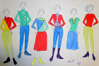
I do some practices on my design with different color mix. I used analogous, triad and adjacent complementary color on my prediction of the collection of Marc Jacobs’ Fall Winter 09. Moreover, the principle of familiarity was applied that is based on the concept that familiarity is pleasing and readily accepted. As a result, color schemes based on nature will seem pleasing to most people. In addition, light and dark variation of the same color will harmonize.
In conclusion, I can easily apply color theories, monochromatic, analogous, complementary, adjacent complementary, double split complementary, etc. on my daily life. Moreover, I can use the principle of familiarity, the principle of novelty, etc. to analysis the color schemes of the advertisements, the collections, and the decoration of stores.
11/27/2008
my final project (final)
final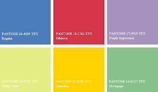


Priciple of Resemblance
Harmonious color, Less differences, Multiple colors of different hue and lightness
Analogous Color Schemes
1) Aggressive Colors: hibiscus (high chroma, contrast of value), dandclion (high chroma, contrast of value)
Receding Colors: sunny lime (constant chroma, low value)
2)
Aggressive Colors: dandclion (high chroma, contrast of value)
Receding Colors: greengage (high chroma, contrast of value), regatta (high chroma, contrast of value)
4)
Aggressive Colors: purple impression (constant chroma, low value), hibiscus (high chroma, contrast of value)
Receding Colors: regatta (high chroma, contrast of value)
5)
Aggressive Colors: purple impression (constant chroma, low value), dandclion (high chroma, contrast of value)
Receding Colors: greengage (constant chroma, low value), regatta (constant chroma, low value)
Triad + Analogous Color Schemes
3)
Aggressive Colors: hibiscus (high chroma, contrast of value), dandclion (high chroma, contrast of value)
Receding Colors: greengage (constant chroma, low value), regatta (constant chroma, low value)
Adjacent Complementary Color Schemes
6)
Aggressive Colors: hibiscus (high chroma, contrast of value), dandclion (high chroma, contrast of value), violet (high chroma, contrast of value)
Receding Colors: sunny lime (constant chroma, low value)


11/26/2008


11/23/2008


11/21/2008


11/20/2008


color create space


principle of familiarity
analogous color
black, white, yellow orange (adding black), yellow green (adding white)
11/19/2008


11/12/2008

11/09/2008


Subscribe to:
Comments (Atom)
